Friday, October 12, 2012
Ignorance is curable. Stupid is forever.©
In our jobs report analysis last week we said what we’ve been saying for a long time. We are not in a “recovery” because there is no such thing as a “recovery” without an expanding labor market.
So, what should a recovery look like?
Several of you e-mailed or called and pointed out that we’ve been demonstrating what a recovery doesn’t look like, but we haven’t really shown what a real recovery does look like. EXCELLENT POINT. Thank you!
We dropped everything else this week to do the research, compile the data and generate the graphs so you can compare this “recovery” period to those of the past five recessions going back to 1973.
A true economic recovery following a recession necessarily features an expanding labor market. An expanding labor market consists of two key elements. One is the number of people reporting as available to work (the civilian labor force) and the other is the number of the civilian labor force members that have a job (total employed). In order to be in a recovery BOTH of those groups need to demonstrate expansion.
7.8% is not credible because…
As we discussed last week, no one finds a .3% drop in a single month to be credible. With over 12 million people out of work, 100,000 new jobs just can’t move the needle like that. Heck, a couple of months ago an increase of 163,000 jobs (since revised lower) sent the unemployment rate up! How can this be? Without going into the detail, it is very simple arithmetic. If the growth in new jobs outpaces the growth of the civilian labor force the percent unemployed will fall even though things aren’t getting better. So, the labor market is not improving unless the unemployment rate falls in the face of an expanding civilian labor force AND an increase in the number of new hires. Beyond that, it just doesn’t fit with all the other data out there. For example, we need about 250,000 new jobs per month just to break even! Our GDP is at 1.3% (about .9% if we take out inventories). To get our unemployment rate down to 7.8% our GDP would need to have been about 4%.
Since last we spoke…
We are not conspiracy theorists, but come on… Are we expected to believe the big upward revision in new government jobs was the portion that was slow to report? Are we asked to forget that government jobs don’t signal private sector expansion? We found out that the administration “secured” an agreement with Lockheed Martin to postpone layoff announcements until after the election. On Thursday 10/11 an equally implausible drop in first-time unemployment benefit claims was trumpeted as the best in four years. Hours later we learned that California’s count wasn’t included. When we add that, the numbers aren’t so good and, of course, last week’s numbers were revised up. Like we said last week, if these are the shenanigans we know about…
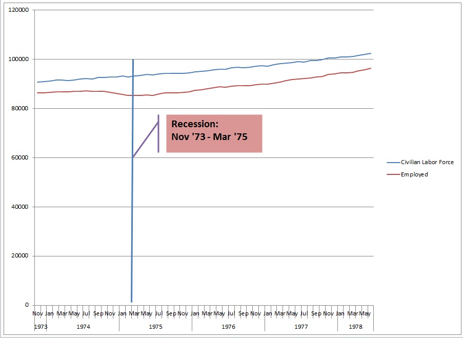
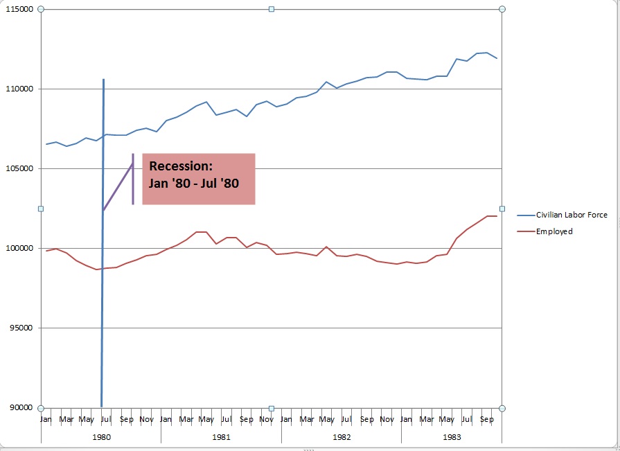
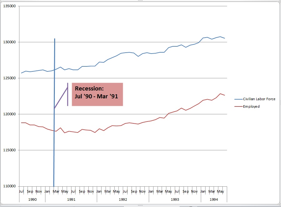
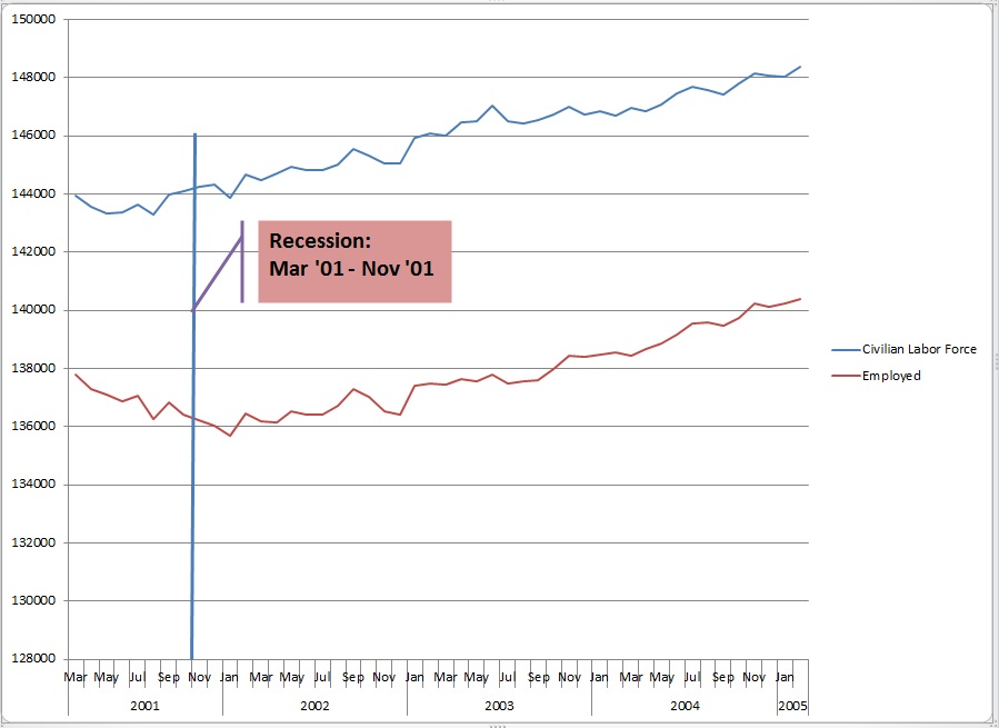
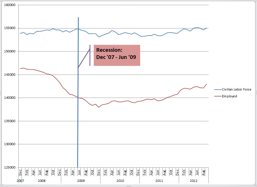
OK, so what does a real economic recovery look like? Below are graphs showing the size of the civilian labor force and the number of employed people from the official beginning month of the recessions going back to 1973. The graphs extend out for the first forty months of recovery following the official end of each recession which is where we are with the most recent September 2012 jobs report.
♫ ♪ One of These Things is Not Like the Others… ♪ ♫
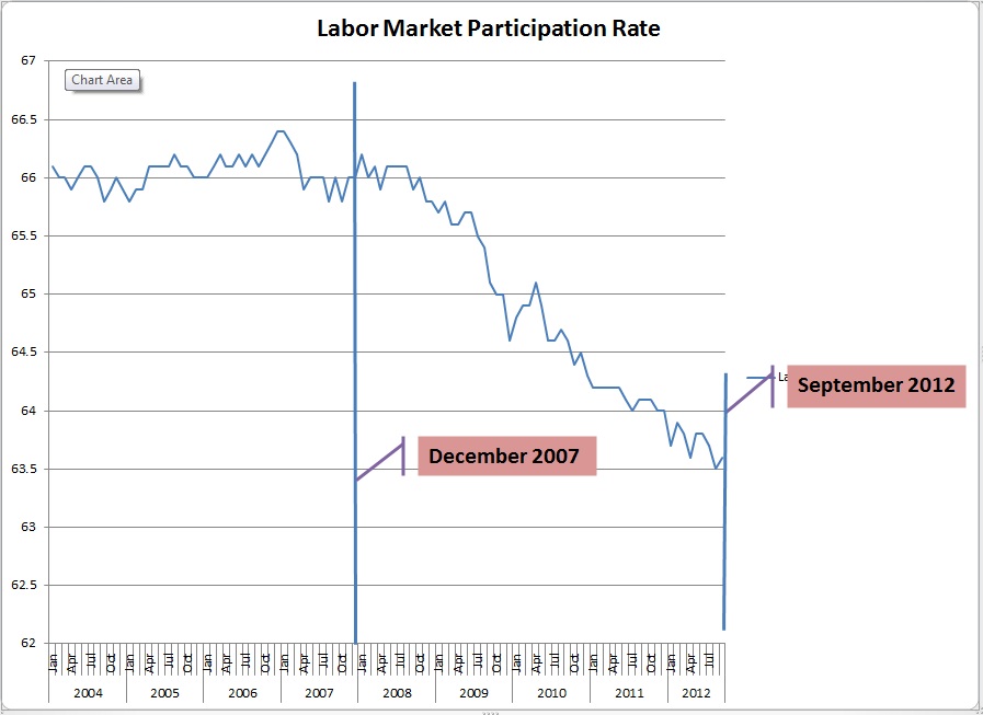
It makes sense for Big Bird to be a media headliner this week because our analysis is no more complicated than applying the Sesame Street Rule; One of These Things is not Like the Others!! Please note the movement of the labor force size and the number of employed people. The current “recovery” profile does not resemble any of the past 5 recoveries as the labor force size is flat. That’s the key to the falling rate. The final graph shows the participation rate. As you will see the participation rate had been quite stable for the prior 4 years and then plummeted during the “recovery.” This validates the graph showing virtually no material movement in the size of the labor force while jobs are added moving the lines closer together. This gives us a lower unemployment rate even though the labor market is not improved.
All data for the graphs was acquired from the official Bureau of Labor Statistics historical tables which can be found at http://www.bls.gov/cps/cpsatabs.htm
This last graph shows the percentage of prospective workers who are actually participating in the labor market. This is what is meant when you hear about all the people who have given up and left the labor market.
It’s striking. Even the recessions that only last a few months demonstrate an increase in labor force size. It has never been stagnant like it has been for the last forty months!
So, comparing this recession-recovery period with the previous five indicates a dramatic difference between the profiles.
Someone could tell us that this “recovery” is a flute. If we didn’t know better we might believe it. We could repeat it. We could even broadcast it. But even Big Bird would never be able to blow hard enough to make music with it…because it’s not a flute.
As always, thanks so much for reading. We hope you enjoyed it and stay tuned…
Every effort is made to ensure accuracy of data transcription but accuracy cannot be guaranteed. Referenced sources should be reviewed. Any analysis represents the opinion of Blue World Asset Managers, Ltd. who does not warrant or guarantee predictions based on its analysis.
©Blue World Asset Managers, LTD Friday, October 12, 2012


