Counterfeiting is a Very Serious Crime…Unless the Fed Does It??

Thursday, June 20, 2013

Ignorance is curable. Stupid is forever.©

We have been ringing the alarm bell about this in our posts and Matt has spoken of it on the radio.  We are getting more and more questions about it as the likelihood of slowing the current bond buying program (Q.E. whatever) looms.

Ask anyone, including market “experts” if it’s a good idea or bad idea for the government to “kick the can down the road” and they’ll say it’s a bad idea.  Then ask if they want the Fed to slow the bond buying program and they’ll exclaim “NO” in a panicked voice!  What this betrays is a complete lack of understanding of what “Quantitative Easing” actually is.

First of all, it should be of great concern to anyone with money in the markets that government action, even contemplated government action, has become more important than economic fundamentals.  Think of how absurd it is for the markets to panic at the thought of improving economic conditions that would lead to LESS government interference.  Ya get that?  THE MARKETS SELL OFF WHEN THE ECONOMY SHOWS SIGNS OF IMPROVING!!  That is absolutely terrifying.  When reality catches up, and it always will eventually, the results for those in the markets unprotected will be potentially catastrophic. 

So, what is “Quantitative Easing” in actual practice?  As with most things it is very simple.  The Fed is buying short term debt (bonds) that are nearing expiration and refinancing the debt for a longer term.  It is the very definition of “kicking the can down the road.”  That is deplorably dangerous economic policy as it is, but never discount the government’s ability to take a bad idea and make it worse.  WE DON’T HAVE THE CASH TO PAY OFF THESE LOANS!  They are printing money out of thin air to pay off the loans and borrow the money for a longer period!  If you did that you’d be arrested for counterfeiting!  Does that help explain why you are hearing all this talk about the U.S. dollar no longer being the world’s reserve currency?  By printing more supply of money without the demand for it we dilute the value of the currency and that’s why counterfeiting is illegal.  There are two blog posts we did last year that explain this in more detail including an explanation of inflation and commodity impacts.  They are:

Some Inconvenient Truths can be Backed Up by Real Math and Science Parts 1 and 2

They can be found at:

http://ht.ly/me0JN

and

http://ht.ly/me3Ka

We hope this helps answer some of the questions surrounding the market’s behavior these days.  Call or e-mail us with any others!

Thanks for reading and please stay tuned…

Every effort is made to ensure accuracy of data transcription but accuracy cannot be guaranteed.  Referenced sources should be reviewed.  Any analysis represents the opinion of Blue World Asset Managers, Ltd. who does not warrant or guarantee predictions based on its analysis.

©Blue World Asset Managers, LTD Thursday, June 20, 2013

Blue World Employment Situation Report Analysis 12-07-2012

Release Date:  Usually the first Friday of each month

Release Site: www.bls.gov

Market Sensitivity: VERY HIGH

Management Value: VERY HIGH

Friday, December 07, 2012

Brain surgery is not rocket science to a brain surgeon©

C’mon everybody.  Sing along.  You know the words to this song.  The economy added a net 146,000 jobs and the unemployment rate dropped to 7.7%.  I admit we were unable to be even cautiously optimistic about the headline numbers due to the details in some other reports out during the month, especially regional manufacturing data and the GDP estimate.  We had predicted that GDP would be revised lower but it was actually revised higher.  A glimmer of optimism was squelched immediately by the detail which showed the GDP increase coming on the inventory side while the demand side slid.  That indicates a data blip as opposed to the emergence of a sustainable upward trend.

November labor details tell a familiar story so here are the most illuminating.  We got 146,000 new jobs but the labor force suffered a huge 350,000 worker reduction.  The participation rate fell another .2% and the number of employed people fell by another 122,000.  The work week remained flat for all employees and the overtime hours in manufacturing are still unchanged at 3.2 hours per week.  There was some improvement in wages reported but still not enough to outpace inflation.  Additionally, pay readings have been volatile and given to significant revisions over the last couple of years so we can’t put too much stock in single-month changes.  College educated unemployment is still way too high but at least has been below 4% (3.8) for two months in a row.  That number needs to go below 2.5% in order for any real recovery to be underway.

On the news there was a vertical spike in the S&P 500 futures but it only got back to about even on last night’s close.  As the detail is digested and weak consumer sentiment numbers worked their way into the mix, the charts illustrated a retreat back toward the baseline and now (9:56a C) the S&P has gone fractionally negative while crude and corn retreat and gold is choppy and largely lateral.

So far the outcome of the election has done little to quell any of the uncertainty that has hung over the economy for the last few years.  Aggression in the Middle East, continued turmoil in Europe, fiscal cliff worries, unresolved tax policy and anxiety over the implementation of Obama Care in the face of what appear to be developing new legal challenges to the Affordable Care Act maintain their grip on those we rely on to spend, invest and hire.

The markets continue their upward trend.  While we have been happy to participate in the run we continue to be very cautious and we’re bringing the safety net up tighter and tighter.  We have significant concerns about what seems to drive the markets these days.  Government commentary, be it from our Fed or European leaders, have greater impact on market sentiment than economic and corporate fundamentals.  We believe this as a driver is unsustainable and at some point market fundamentals will have to trump. When will that happen?  If you had told us in 1995 that U.S. Ambassadors were being raped and murdered, Palestine had been admitted to the U.N., Iran was close to nukes, Israel was engaged in missile play, Syria was readying chemical weapons to use on its own people, North Korea was rattling its saber, the government owned private car companies, one sixth of the economy was being nationalized, there were only three banks left, GDP was under 3%, unemployment was over 7.5%, corporate profits were mixed as revenues begin to slip across the board and the markets are UP, we’d have recommended you seek professional intervention from a qualified mental health provider.  Historically these conditions would drive the markets to extreme lows.  Today, however, they continue to climb.  We’ll ride the wave, too, but the defense is still on the field and ready to play when reality and perception align.  Whatever defensive strategy you/your financial advisor employ, we think it prudent to keep it executable at very short notice.

This is our final jobs analysis to post for 2012.  Thanks so much for reading and commenting.  God bless you and your families.  Have a very Merry Christmas and a Happy New Year.  We’ll see ya on the other side.

GO IRISH!!

Release Site: www.bls.gov

Every effort is made to ensure accuracy of data transcription but accuracy cannot be guaranteed.  The official release site should be cross referenced.  The analysis represents the opinion of Blue World Asset Managers, Ltd. who does not warrant or guarantee predictions based on its analysis.

©Blue World Asset Managers, LTD Friday, December 07, 2012

A Flute With No Holes Is Not a Flute and A Recovery With No Jobs Is Not a Recovery.

Friday, October 12, 2012

Ignorance is curable. Stupid is forever.©


In our jobs report analysis last week we said what we’ve been saying for a long time.  We are not in a “recovery” because there is no such thing as a “recovery” without an expanding labor market.

So, what should a recovery look like?

Several of you e-mailed or called and pointed out that we’ve been demonstrating what a recovery doesn’t look like, but we haven’t really shown what a real recovery does look like. EXCELLENT POINT.  Thank you!

We dropped everything else this week to do the research, compile the data and generate the graphs so you can compare this “recovery” period to those of the past five recessions going back to 1973.

A true economic recovery following a recession necessarily features an expanding labor market.  An expanding labor market consists of two key elements.  One is the number of people reporting as available to work (the civilian labor force) and the other is the number of the civilian labor force members that have a job (total employed).   In order to be in a recovery BOTH of those groups need to demonstrate expansion.

7.8% is not credible because…

As we discussed last week, no one finds a .3% drop in a single month to be credible.  With over 12 million people out of work, 100,000 new jobs just can’t move the needle like that.  Heck, a couple of months ago an increase of 163,000 jobs (since revised lower) sent the unemployment rate up!  How can this be?  Without going into the detail, it is very simple arithmetic.  If the growth in new jobs outpaces the growth of the civilian labor force the percent unemployed will fall even though things aren’t getting better.  So, the labor market is not improving unless the unemployment rate falls in the face of an expanding civilian labor force AND an increase in the number of new hires.  Beyond that, it just doesn’t fit with all the other data out there.  For example, we need about 250,000 new jobs per month just to break even!  Our GDP is at 1.3% (about .9% if we take out inventories).  To get our unemployment rate down to 7.8% our GDP would need to have been about 4%.

Since last we spoke…

We are not conspiracy theorists, but come on…  Are we expected to believe the big upward revision in new government jobs was the portion that was slow to report?  Are we asked to forget that government jobs don’t signal private sector expansion?  We found out that the administration “secured” an agreement with Lockheed Martin to postpone layoff announcements until after the election.  On Thursday 10/11 an equally implausible drop in first-time unemployment benefit claims was trumpeted as the best in four years.  Hours later we learned that California’s count wasn’t included.  When we add that, the numbers aren’t so good and, of course, last week’s numbers were revised up.  Like we said last week, if these are the shenanigans we know about…

OK, so what does a real economic recovery look like?  Below are graphs showing the size of the civilian labor force and the number of employed people from the official beginning month of the recessions going back to 1973.  The graphs extend out for the first forty months of recovery following the official end of each recession which is where we are with the most recent September 2012 jobs report.

♫ ♪ One of These Things is Not Like the Others… ♪ ♫

It makes sense for Big Bird to be a media headliner this week because our analysis is no more complicated than applying the Sesame Street Rule; One of These Things is not Like the Others!!  Please note the movement of the labor force size and the number of employed people.  The current “recovery” profile does not resemble any of the past 5 recoveries as the labor force size is flat.  That’s the key to the falling rate.  The final graph shows the participation rate.  As you will see the participation rate had been quite stable for the prior 4 years and then plummeted during the “recovery.”  This validates the graph showing virtually no material movement in the size of the labor force while jobs are added moving the lines closer together.  This gives us a lower unemployment rate even though the labor market is not improved.

All data for the graphs was acquired from the official Bureau of Labor Statistics historical tables which can be found at http://www.bls.gov/cps/cpsatabs.htm


This last graph shows the percentage of prospective workers who are actually participating in the labor market.  This is what is meant when you hear about all the people who have given up and left the labor market.


It’s striking.  Even the recessions that only last a few months demonstrate an increase in labor force size.  It has never been stagnant like it has been for the last forty months!

So, comparing this recession-recovery period with the previous five indicates a dramatic difference between the profiles.

Someone could tell us that this “recovery” is a flute.  If we didn’t know better we might believe it.  We could repeat it.  We could even broadcast it.  But even Big Bird would never be able to blow hard enough to make music with it…because it’s not a flute.

As always, thanks so much for reading.  We hope you enjoyed it and stay tuned…

Every effort is made to ensure accuracy of data transcription but accuracy cannot be guaranteed.  Referenced sources should be reviewed.  Any analysis represents the opinion of Blue World Asset Managers, Ltd. who does not warrant or guarantee predictions based on its analysis.

©Blue World Asset Managers, LTD Friday, October 12, 2012


Blue World Employment Situation Report Analysis September 2 2011

Blue World Employment Situation Report Analysis

Release Date:  Usually the first Friday of each month

Release Site: www.bls.gov

Market Sensitivity: VERY HIGH

Management Value: VERY HIGH

Friday, September 02, 2011

Brain surgery is not rocket science to a brain surgeon©

Mr. Obama’s jobs plan better be a jobs plan that includes excluding the government from any further “help.”  We already know we are going to hear about “stimulus” without calling it “stimulus.”  We are going to hear about “shovel-ready” without calling it “shovel-ready.”  We are going to hear about infrastructure, green, tax credits for hiring, etc.  The content of this jobs address has already been leaked and, unless you suffer from Alzheimer’s, the ideas being touted as new are not new.  In all fairness we can at least say euphemistic renovation of politically toxic buzz words won’t do any harm.  The fear must be that the proposed double-down will get implemented.  This is no longer theory, friends.  We have the original forecasts recorded.  We have a data pool deep enough for analysis and that analysis exposes unmistakable trends.  Those trends are bad. 

We don’t care what works as long as it works.  By “works” we mean an economy that is in aggressive growth mode with rising GDP, falling unemployment, increased productivity, increasing personal wealth and ever-rising optimism and morale that encourages an environment driven by personal responsibility and motivated by the idea that reward will be determined by effort.  In spite of some “experts'” proclamations to the contrary we have concluded that government spending and extended unemployment benefits will not promote those objectives.  We also maintain the administration’s definition of “works” differs from ours.

The Devil is always in the details.  We can begin with the downward revision of last month’s job gains.  The headliner rate remained at 9.1%.   The number of new jobs added; zero.  That means none lost (net) either.  Already some “experts” are saying “that’s great”, “it got no worse”, “we’re obviously turning the corner” and similar nonsense.  We’ve been reading this report for a long time, folks, and we’ve never seen “0” at the end of that table.  That, alone, is unsettling.  There are, however, some noteworthy and ominous signs in the numbers.  Those over 25 with a Bachelor’s and higher remain at a staggering 4.3%.  Black workers’ unemployed rate jumped .8% overall with black men 20+ posting  a horrifying full 1% jobless rate increase from 17% to 18% July to August.  Those numbers are bad enough.  The most concerning to us is the following: Goods producing, construction, manufacturing, retail and I.T. all posted net job losses. That has not happened in a long time.  In addition, the number of hours worked per week and the hourly rate of pay had been on a long, steady, albeit, uninspiring rise.  They both fell in August.   

 Businesses should not and will not hire while under a dark cloud of government animosity, regulatory uncertainty, high unemployment, tanking consumer confidence and deplorable demand conditions.  A $20k per year employee costs a business double that to employ.  No competent business manager is going to think a $2500 offset to a $40k loss is an incentive to hire.  Only a forecast of improving demand is an incentive to hire.  The government produces nothing, brings nothing to market and is not dependent on customer satisfaction for survival.  Many in government seem to think the private sector works the same way.  Hint:  It doesn’t.

If you missed our post on The Confusion Suffered by “Experts” the link is below.  It describes some reasons why so many headlines contain words like “surprised”, “unexpected” “shocked”, etc.

 http://owl.li/6jNBf

 For us, our clients and our readers we remain defensive with our market investments and do not anticipate a change in that posture in the absence of any evidence of significant policy change. 

 Thanks for reading and, please, stay tuned…

 Release Site: www.bls.gov

Every effort is made to ensure accuracy of data transcription but accuracy cannot be guaranteed.  The official release site should be cross referenced.  The analysis represents the opinion of Blue World Asset Managers, Ltd. who does not warrant or guarantee predictions based on its analysis.

©Blue World Asset Managers, LTD Friday, September 02, 2011

The Confusion Suffered by “Experts”

Tuesday, August 16, 2011

Brain surgery is not rocket science to a brain surgeon.©

The Confusion Suffered by “Experts”

We are being asked a question pretty routinely lately.  In our Tweets and our blog posts we always exhibit an enthusiastic irreverence for certain economists, market commentators, media personalities and politicians by identifying them as “experts.”  We go on to explain why what they said was silly.  We have little use or respect for those whose headlines routinely contain words like “unexpected”, “surprised”, etc.  We often review our past posts regarding our opinions on where the economy is headed to make sure we have had a good handle on what is going on or if we need to shift our observational and analytical methodology.  Ya see, “experts”, that’s what you do if your analysis, decisions and policy aren’t working.  We are pleased yet sad to say if you follow us none of the economic data that “surprises” the “experts” is ever a bombshell for you.  This has led many of our readers to ask Why are the “Experts” Always Wrong?

There are several reasons ranging from academically focused and financially motivated to politically goaded.  In other words we must always consider the source.  The financially and politically motivated crowd is, we believe, reasonably small.  Advocates of the party in power will try to up-spin data and market beneficiaries have a vested interest in making any news look as good as possible.  That leaves a much larger group that is just plain wrong.  Why are these “experts” so easily misguided by the same data we review?  We have a theory.  The problem is mostly academic.  Blue World employs people.  Blue World principals and network resources employ lots more people.  Blue World clients employ lots, lots more people.  Decisions on how many are employed is partially based on a comprehensive review of the economic data released, just like many of our “experts.”  The difference is we HAVE EMPLOYED REAL PEOPLE and INVESTED REAL MONEY to make businesses (our own and our client’s) successful in the private sector.  We don’t just sit in cubicles and read data.  We compare the data to what we see happening around us in the real world.  Just driving  around town or across the country and taking note of strip mall vacancies can give some great anecdotal corroboration or refutation of the spin in the headlines. 

Data is just that.  Data.  It should be used as a metric against which to measure reality.  If we don’t understand how the data is gathered we are likely to make poor decisions based on it AND be at the mercy of those who do know and choose to ‘spin.’  For example, the unemployment rate dropped .1% last month.  Good news, right?  Not if we know how to read the report.  The number of unemployed people actually rose but the sample size changed such that the number of people being counted shifted. This created an artificial improvement the percentage even though reality worsened.  This is an observation, not an accusation, but I’m afraid there is a degree of estimating that goes into the BLS Unemployment numbers, and that creates the opportunity to mislead at the headline.  That’s why Blue World does the monthly analysis, to remove the spin and provide actionable intelligence to business owners, managers and investors. 

Another example: a great deal of predictive emphasis is placed on the ADP job numbers.  As the largest payroll processor in the company it is assumed that an increase in processed paychecks equals positive private sector job growth.  The problem is that ADP counts all payrolls, not all workers.  In other words one worker may be holding down three part-time jobs because he can’t find full time employment.  This looks like three new jobs but it is only one person working!  This statistic is not accounted for in the ADP report but is in the BLS release.  It is called “Employed Persons at Work Part-Time for Economic Reasons.” “For Economic Reasons” means a worker wants full time work but can’t find it.  It is found in Table A: Household Data of the monthly BLS report.  If we see a rising trend in the ADP report and want to deduce good or bad news from it we must compare that to the trend of part-timers for economic reasons.  If that trend is also rising we don’t have a good trend for private sector employment.

We did a blog some time ago that shows how all of the economic reports out there have just one common goal.  They all seek to determine what our mood is.  That’s really it.  The full post is entitled Is There a Meaningful Economic Recovery Going on Out There? and can be found at http://ow.ly/4M2Dn It shows what we predicted for the economy over a year ago.  Sometimes it’s no fun to be right.   The most relevant passage to this post follows:

Now, there are boatloads of economic releases that come out each week, month, quarter, year.  There is GDP, the unemployment report, housing starts, consumer confidence index, new home sales, existing home sales, new housing permits, first-time jobless claims, factory orders, manufacturing index and on and on and on… What I want you to realize is that for all the data gathered, analyzed and reported on they all have just one common objective.  It is to see what kind of mood you and I are in as consumers.  If we can determine what kind of mood the consumers are in and what their spending patterns are we can predict which way the economy is likely headed.  If unemployment is headed down, personal income is increasing and GDP is rising it is a darn good bet that good times are-a-comin’.

Often times spin of the data is used to try to shape our mood rather than identify it.  Those who read the detail (or our analysis) are inoculated against such manipulation. 

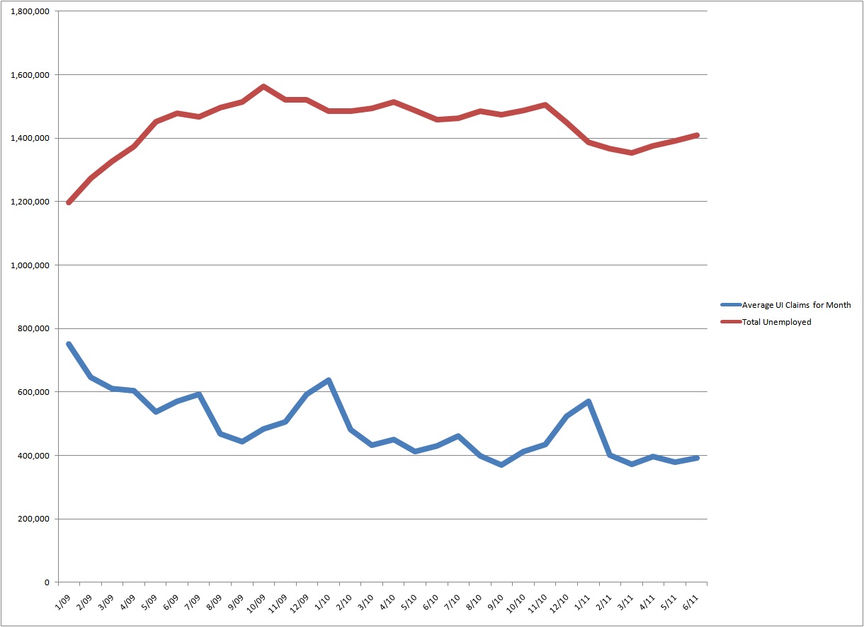
So how are the truly unbiased “experts” fooled?  We have data that comes out weekly, like first-time unemployment insurance claims; monthly, like the Bureau of Labor Statistics (BLS) employment report; and quarterly, like the Gross Domestic Product (GDP) report.  All too often our “experts” use the weekly type releases as predictors of the longer term data.  The correlation during robust recovery and distinctly weakening times can be quite good.  At times of bouncing along the bottom or flying at cruising speed, however, the predictive value predictably deteriorates!  If all you do is sit in a cubicle and look at data (like our “experts”) you’re just going to be wrong due to the inconsistent and sometimes volatile nature of the more short term data.  To illustrate this point the graph below shows the average number of new unemployment insurance claims (weekly) graphed against the actual number of reported unemployed people (monthly) divided by 10 to match the scale. 


Source: www.bls.gov & www.dol.gov

As you can see, if you were to use even the weekly average new claims (blue line) to predict the unemployed totals (red line), you would regularly be “surprised.”  If you were to look for news, good or bad, in the actual weekly numbers you can appreciate that they are even more volatile and unpredictable than the smoothed-out average represented above.  That’s why we roll our eyes and shake our heads when the markets throw a party or a wake every Thursday when the new unemployment insurance claims are announced. 

Any one week, month or quarter’s data does not tell us anything in a vacuum.  Convincing medium to long-term trends coupled with real-world observations ranging from personal income and internal sales to store front vacancies and the mood of our neighbors are the only way to accurately assess the true health of the overall economy.  This type of ongoing observation and analysis of DATA AND THE REAL WORLD is the only way responsible investors, employees, managers and owners (remember that managers and owners are also employees) make decisions about their businesses.  We say brain surgery is not rocket science to a brain surgeon. I am certainly neither.  But even I can predict 9% unemployment, record foreclosures, rising food and gas prices, historically low interest rates, unfathomable Federal debt, ubiquitous commercial vacancies and an ever-weakening dollar do not add up to a recovering economy!  This is why I, and I suspect you, will NEVER be an “expert.”

© Tuesday, August 16, 2011Blue World Asset Managers