Blue World Employment Situation Report Analysis
Release Date: Usually the first Friday of each month
Release Site: www.bls.gov
Market Sensitivity: VERY HIGH
Management Value: VERY HIGH
Monday, December 05, 2011
Ignorance is curable. Stupid is forever.©
We’ve been getting a lot of requests for additional explanation of why we continue to say the labor market is still struggling and there is no meaningful economic recovery going on in spite of the headlines trumpeting a lower unemployment rate. It is quite simple, as we maintain all things are, and easily demonstrable with the cool multi-colored graphs to follow. Before that, however, a brief primer on how the unemployment rate and the number of jobs created are derived would be helpful.
There are two sources that are used. The vulnerabilities of each will be readily apparent. No surprise that the biggest vulnerabilities lie in the human element. They include the need for respondent compliance and honesty plus governmental estimates necessitated by the counting methods. For example, if one has not actively sought work within the past four weeks they are not counted as a member of the labor force. While they attempt to account for this stat in a different table of the report you can see it requires a degree of “estimation.” What might influence those “estimates?” Not sayin’. Just sayin’.
The absurdity of wild market gyrations in response to each month’s release cannot be overstated. No single report is valuable in a vacuum. Only a study of trends makes the data meaningful. Even more, it’s not just a trend in the headline numbers. As we will see, trends in the headline unemployment rate need to be supported by trends in the underlying detail because the unemployment rate can be misleading as in the current case.
The headliner unemployment rate and new jobs created reported in the media is virtually useless to investors, business leaders and strategists without the underlying detail to give it meaning. The unemployment report is touted as a leading or lagging economic indicator depending on what is politically expedient at the time. The truth is that the report is full of leading (predictive) and lagging data. In our monthly analysis posts we always offer a look into some of that detail to find out what just happened, what is happening and what is likely about to happen. This is where the actionable information hides from the headlines. This is where we go to drive informed decisions.
The Report:
As we said, the report is based on two main bodies. They are the Household Survey and the Establishment Survey. Each of these bodies has break-out tables that drill down into the headline data.
Body 1 (Table A) is populated with data gleaned from the Household Survey. As the name implies surveys are sent (or called in) to households across the country and solicit information about the employment status of people in the home. The reported unemployment rate is derived from this survey. Divide the number of unemployed people 16 or older by the total number of available workers (civilian labor force) and we’ve got our unemployment rate. Response to this survey tends to be a very high percentage of surveys returned in a very short time so revisions to this body of the report are rarely necessary. That is also why it is a leading indicator of economic direction. Technology allows companies to see and react to softening or firming demand for their products or services much faster than in eras past. They tend to react by cutting or adding staff before the official onset of or emergence from a recession making any identifiable 3 or 4 month trend a pretty reliable indicator of the direction of the economy.
Body 2 (Table B) data is gathered via the Establishment Survey. This survey is sent directly to businesses in order to gather information about the size of their payrolls. More employees on the payroll than the prior month means new jobs were created. Fewer employees getting a check means jobs were lost. It’s that simple. The establishment survey does not include farm workers, the self employed or domestic help. As such, it is the most direct measure of hiring and firing by firms. That’s why it is considered the more valuable metric for policy makers, business managers and investors and usually has the bigger impact on the stock markets. This tends to be a lagging indicator because companies are slow to add to payroll until they’re sure an upturn has legs. As such, for confirmation we look at average weekly hours worked and overtime, as an example of detail. These would be considered leading indicators because the data shows what is happening right now. If we see trending increases here it is a decent bet that new job creation is on the way.
We Can’t Claim an Improved Labor Market by Making the Civilian Labor Force Smaller
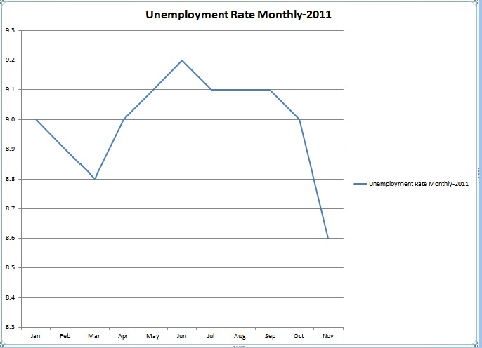
So, armed with that understanding let’s look at some trends relative to last week’s headline drop from 9% to 8.6%. As the graph shows, not only do we lack a trend, the headline unemployment rate indicates what Blue World continues to describe as an economy just bouncing along in neutral waiting for an incentive to pick a direction. In addition, the rate drop appears unrealistic relative to other month-over-month changes for the past year.

So, to check the validity of the “improving” status we look to hours worked per week and overtime hours per week in manufacturing. Through November of 2011 the average in manufacturing has been 41.3 hours worked per week with a range of 41.1 to 41.5 hours. In order for the job market to be looking up we want to demonstrate a three to four month trend of 41.5+ hours. We need to see overtime hours average over 4.5 hours per week for three to four months as well. Through November of 2011 we have averaged 4.1 hours with a range of 4.1 to 4.2. Additionally, the diffusion index in manufacturing stands at 49.4. That means that less than 50% of manufacturing firms have expanded payrolls. For comparison it was a much better 58 in Nov 2010 and has trended down to the current for the last three months. You can start to appreciate how valuable the monthly jobs report detail can be in eliminating surprises from the quarterly GDP report!
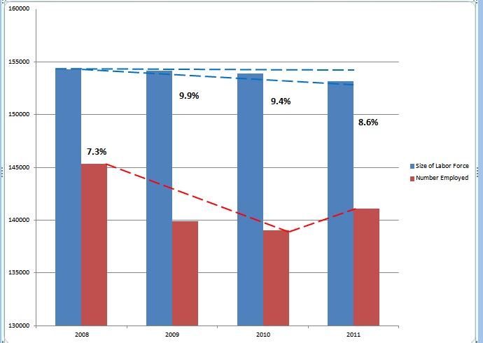
OK, so, with all that doom and gloom how did the headline unemployment rate fall a ridiculous .4% in a single month? Simple. We made the work force smaller and the number of payrolls bigger. That’ll getcha a smaller percentage every time! Below is a graph showing the size of the civilian labor force the number of employed people and the year end unemployment rate for the last four years. All graph data are sourced from www.bls.gov. 2011 is year to date November.

As you can see the detail of hours worked in manufacturing (and some other detail) do not support the notion that the labor market is improving because it’s not! Making the workforce smaller does not an improving labor market make. I think it’s clear that a truly recovering economy will show a decreasing unemployment rate in spite of an expanding labor market. In other words we need the number of people getting jobs to outpace the expansion of the labor force. It is estimated that we would need 150,000 new jobs each month just to break even right now. We just haven’t seen those kinds of numbers in the Establishment Survey. It’s been a consistent pattern of blips and dips.

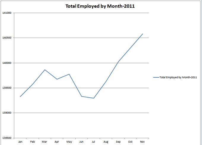
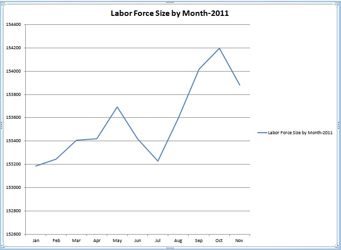
A comparison of the three graphs shown above demonstrates the phenomenon within 2011. The unemployment rate was relatively stable between April and September as changes in the employed and labor force size moved in the same direction and at similar rates. Then in November we see a sharp increase on the employed graph and a simultaneous sharp decline on the work force graph. The unemployment rate graph predictably reflects the phenomenon.
Try as they might the U.S., and world leaders for that matter, would do well to learn that politics cannot replace supply and demand as drivers of economies. With stagnant work week length and corresponding personal earnings the demand cannot return. Until confidence drives demand, and demand drives the need for workers, this pattern will continue or deteriorate. Economics don’t get simpler than that. A record number of Americans are now on some sort of government assistance. That has never and will never improve confidence. It is a boon, however, to those seeking to create dependence.
So, what happened to all those folks who disappeared from the civilian labor force? Did they quit looking for work, stop responding to the surveys or were they, perhaps, “estimated” out of the count? Even if they didn’t make the report this time we are fairly sure they’re still out there so one thing we, and now you, can say for certain is that eventually they’ll show up…and when they do the RATE WILL CHANGE!
Most recent Blue World Jobs Report analysis at:
Thanks for reading. We hope this helped and, please, stay tuned…
Employment Situation Summary Release Site: www.bls.gov
Every effort is made to ensure accuracy of data transcription but accuracy cannot be guaranteed. The official release site should be cross referenced. The analysis represents the opinion of Blue World Asset Managers, Ltd. who does not warrant or guarantee predictions based on its analysis.
©Blue World Asset Managers, LTD Monday, December 05, 2011


