Blue World Jobs Report Analysis November 08 2013

Blue World Employment Situation Report Analysis

Release Date:  Usually the first Friday of each month

Release Site: www.bls.gov

Market Sensitivity: VERY HIGH

Management Value: VERY HIGH

Friday, November 08, 2013

Brain surgery is not rocket science to a brain surgeon©

The Good News Stops at the Headlines…again.

Yesterday I was introduced to a great phrase.  In a nod to my friends at Slocum out of Minneapolis I am reporting, “The good news has a lot of hair on it.”

In a quick take on the GDP report that surprised the “experts” to the upside, the news wasn’t very good.  The 2.8 percent growth came in .8 percent higher than expected, but of that .83 was inventories, so actual growth was below 2 percent.  In addition, the downward trend in personal expenditures that began in 2010 continues. Those are just a couple of the lowlights.

The jobs report didn’t offer much better.  The net jobs created in the private sector came in at 212,000.  They are reporting 204,000 because that number includes government, which shed 8,000 jobs, so the net private sector number is actually 212,000.  While not the 250,000 we need to break even, it sounds better than the low one hundreds we’ve seen lately, right?  Sorry. 

I hope you’re sitting down.

The civilian labor force dropped by 720,000 dragging the participation rate down a whopping .4 percent to 62.8 percent.  To put this in perspective, the records on participation rate go back to 1948.  This number is an all-time record low and running 10 points lower than it was at the worst of the recession.  I grow so weary of the word “recovery.”  

The number of those unemployed rose, and the number of those employed fell by 735,000!  The math is simple – 212,000 new jobs, with 735,000 fewer people with jobs, and the number of those reported as not in the labor force soared by…wait for it…932,000.

We appear to be seeing Obamacare’s initial effect on the labor market as those involuntarily working part-time is on the rise for the past three months.

The overall workweek hours, manufacturing hours, and manufacturing overtime hours are all flat while construction’s week shortened by .2 hours.

The conclusion is becoming almost boilerplate, folks.  If you invest real money and employ real people, we cannot stress caution enough.  The risks are great and many.  Fiscal policy is indefensible and not limited to our shores.  Bond buying seems to never end, and the markets now celebrate bad fundamentals for fear the Fed will quit “stimulating.”  We are not trying to make a living in rational times, and there is no evidence that anyone who could has any appetite to change it.  Stay safe out there.

In addition to the print version on December 6th I am scheduled to do live analysis on Chicago WBBM AM780 and 105.9FM’s Noon Business Hour at about 12:10pm Central.  I hope you can make it.

Have a wonderful and safe Thanksgiving.

Thanks for reading and, please, stay tuned…


Release Site: www.bls.gov

Every effort is made to ensure accuracy of data transcription but accuracy cannot be guaranteed.  The official release site should be cross referenced.  The analysis represents the opinion of Blue World Asset Managers, Ltd. who does not warrant or guarantee predictions based on its analysis.

©Blue World Asset Managers, LTD Friday, November 08, 2013

Pixels vs. Images: A Quick Take on GDP, Markets, Business and the Economy

Wednesday, June 26, 2013

Ignorance is curable. Stupid is forever.©


Pixels vs. Images: A Quick Take on GDP, Markets, Business and the Economy

So, China growth slows and the U.S. markets tank.  U.S. growth slows and the U.S. markets fly?  That’s what happened this month.  We even saw a market “expert’s” headline today “GDP Revised Down but Street Still Optimistic on Economy.”  “Based on what” is the question we’d ask.  Again, every headline today indicates the drop in GDP was “unexpected.”  This continues to be our problem with the “experts.”  They read one day’s news and proclaim a definitive view on the economy.  The next day some new data is released and we get a whole new view, as if yesterday’s news was totally negated or, even worse, totally forgotten.

For market investors that’s fine AS LONG AS they know how to play defense. We, obviously, don’t object to a rising market whatever the reason.  We just worry about the folks who are naked.  As we’ve said, it makes us nervous when there are no fundamentals to support a bull market.  We are happy to make money on it but we are ready for reality shocks, too.  As long as you’ve got your swinging accounts, stops, puts, inverse ETFs, long-short strategies, or whatever other defense you/your advisor employs then let the market run and run with it.  We do.

Running a business is a different story.  As managers we have to be more concerned with economic fundamentals because we don’t have the kind of defensive measures that are available in the markets. The only defense we have is a keen awareness of what the economy is actually doing so that we can make appropriate decisions on everything from hours of operation to inventory stocks to employment.

The deplorable GDP is NOT a surprise if we’ve watched AND REMEMBERED all the other reports from this and previous periods.  No report is valuable unto itself.  Each must be viewed through the prism of the universe of data sets. Then each new data set must be triangulated with and compared to the rest of that universe.  It’s the difference between viewing a single pixel vs. the entire image.  Each data point that is released is just a single pixel in the image that is created when all the pixels are viewed together.

That’s how Blue World does it.  For example, starting with the two most recent employment reports (Blue World Analysis at & ) we saw a continuing trend of flat hours, overtime hours and wage growth in manufacturing.  The diffusion index (number of companies hiring) fell below fifty percent and the labor force remains stagnant.  Then, all the regional Fed reports ranged from negative elements to negative across the board in each of the last two months.  Sure, we hear some of you yelling at us about the positive Durable Goods report this month but, again, viewed historically the reports has been very volatile. “Good” is nowhere near what “good” should/used to be and the current year over year level is no better than February of 2012 and far worse than it was in 2010!  See Econoday’s chart at .

The markets do not reflect reality.  Please don’t use them as a gauge to make decisions in your sector, business or department.  Just ride them as they produce and let us know if you’d like help with the defense.

There is tremendous uncertainty regarding the effect of tax policy, ObamaCare, immigration reform and a multitude of other domestic and international issues.  Follow Blue World for a big-picture take on the economy and to aid in business decisions.  Call us for individual help and analysis.

Our assessment continues to be that the economy is not in a meaningful recovery.  We have an extensive collection of pixels that we organize into an image to back up that assessment.  That’s why we typically only use the word “unexpected” when we read an “expert” who got it right.

As always, thanks for taking the time and stay tuned…


Every effort is made to ensure accuracy of data transcription but accuracy cannot be guaranteed.  Referenced sources should be reviewed.  Any analysis represents the opinion of Blue World Asset Managers, Ltd. who does not warrant or guarantee predictions based on its analysis.

©Blue World Asset Managers, LTD Wednesday, June 26, 2013

Counterfeiting is a Very Serious Crime…Unless the Fed Does It??

Thursday, June 20, 2013

Ignorance is curable. Stupid is forever.©

We have been ringing the alarm bell about this in our posts and Matt has spoken of it on the radio.  We are getting more and more questions about it as the likelihood of slowing the current bond buying program (Q.E. whatever) looms.

Ask anyone, including market “experts” if it’s a good idea or bad idea for the government to “kick the can down the road” and they’ll say it’s a bad idea.  Then ask if they want the Fed to slow the bond buying program and they’ll exclaim “NO” in a panicked voice!  What this betrays is a complete lack of understanding of what “Quantitative Easing” actually is.

First of all, it should be of great concern to anyone with money in the markets that government action, even contemplated government action, has become more important than economic fundamentals.  Think of how absurd it is for the markets to panic at the thought of improving economic conditions that would lead to LESS government interference.  Ya get that?  THE MARKETS SELL OFF WHEN THE ECONOMY SHOWS SIGNS OF IMPROVING!!  That is absolutely terrifying.  When reality catches up, and it always will eventually, the results for those in the markets unprotected will be potentially catastrophic. 

So, what is “Quantitative Easing” in actual practice?  As with most things it is very simple.  The Fed is buying short term debt (bonds) that are nearing expiration and refinancing the debt for a longer term.  It is the very definition of “kicking the can down the road.”  That is deplorably dangerous economic policy as it is, but never discount the government’s ability to take a bad idea and make it worse.  WE DON’T HAVE THE CASH TO PAY OFF THESE LOANS!  They are printing money out of thin air to pay off the loans and borrow the money for a longer period!  If you did that you’d be arrested for counterfeiting!  Does that help explain why you are hearing all this talk about the U.S. dollar no longer being the world’s reserve currency?  By printing more supply of money without the demand for it we dilute the value of the currency and that’s why counterfeiting is illegal.  There are two blog posts we did last year that explain this in more detail including an explanation of inflation and commodity impacts.  They are:

Some Inconvenient Truths can be Backed Up by Real Math and Science Parts 1 and 2

They can be found at:

and

We hope this helps answer some of the questions surrounding the market’s behavior these days.  Call or e-mail us with any others!

Thanks for reading and please stay tuned…

Every effort is made to ensure accuracy of data transcription but accuracy cannot be guaranteed.  Referenced sources should be reviewed.  Any analysis represents the opinion of Blue World Asset Managers, Ltd. who does not warrant or guarantee predictions based on its analysis.

©Blue World Asset Managers, LTD Thursday, June 20, 2013

A Flute With No Holes Is Not a Flute and A Recovery With No Jobs Is Not a Recovery.

Friday, October 12, 2012

Ignorance is curable. Stupid is forever.©


In our jobs report analysis last week we said what we’ve been saying for a long time.  We are not in a “recovery” because there is no such thing as a “recovery” without an expanding labor market.

So, what should a recovery look like?

Several of you e-mailed or called and pointed out that we’ve been demonstrating what a recovery doesn’t look like, but we haven’t really shown what a real recovery does look like. EXCELLENT POINT.  Thank you!

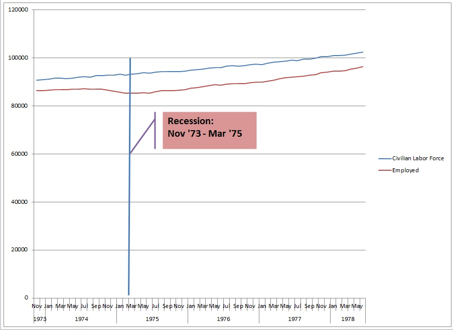
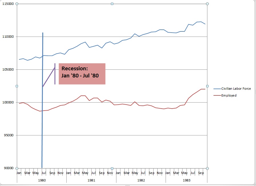
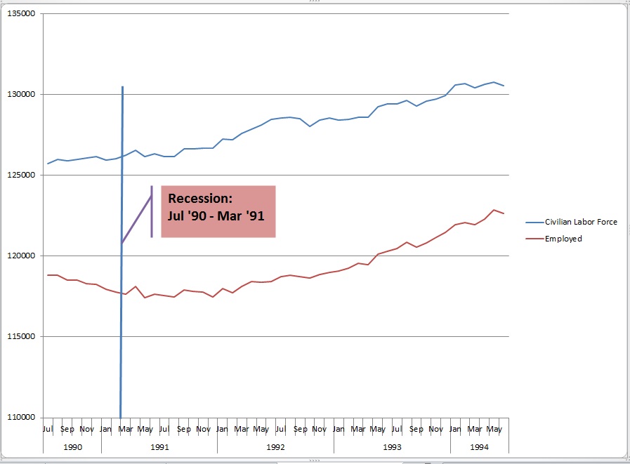
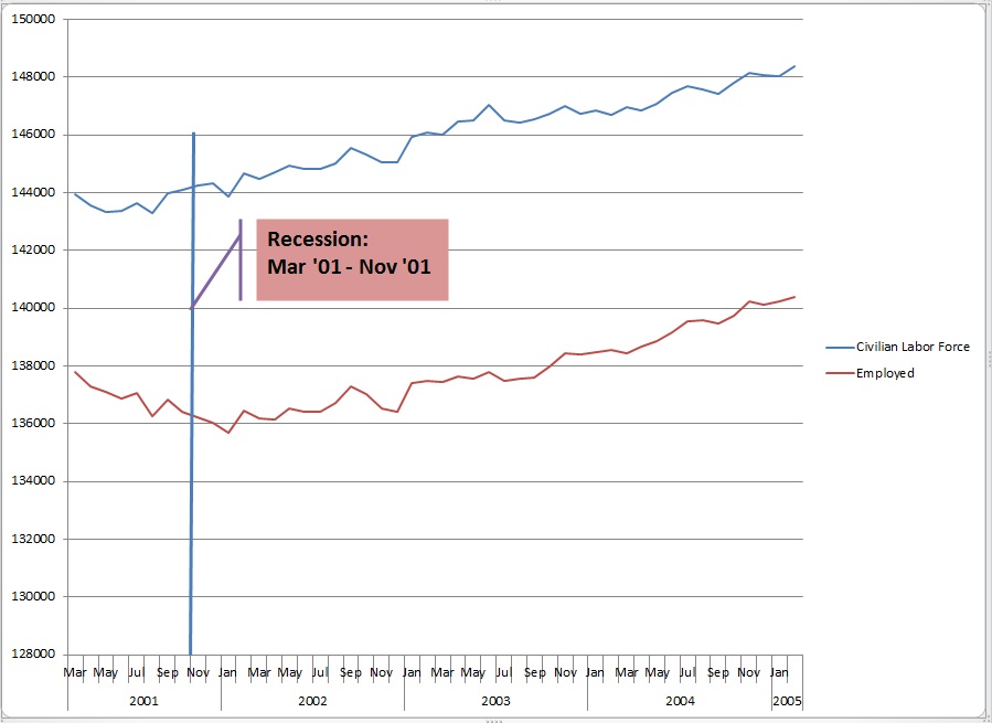
We dropped everything else this week to do the research, compile the data and generate the graphs so you can compare this “recovery” period to those of the past five recessions going back to 1973.

A true economic recovery following a recession necessarily features an expanding labor market.  An expanding labor market consists of two key elements.  One is the number of people reporting as available to work (the civilian labor force) and the other is the number of the civilian labor force members that have a job (total employed).   In order to be in a recovery BOTH of those groups need to demonstrate expansion.

7.8% is not credible because…

As we discussed last week, no one finds a .3% drop in a single month to be credible.  With over 12 million people out of work, 100,000 new jobs just can’t move the needle like that.  Heck, a couple of months ago an increase of 163,000 jobs (since revised lower) sent the unemployment rate up!  How can this be?  Without going into the detail, it is very simple arithmetic.  If the growth in new jobs outpaces the growth of the civilian labor force the percent unemployed will fall even though things aren’t getting better.  So, the labor market is not improving unless the unemployment rate falls in the face of an expanding civilian labor force AND an increase in the number of new hires.  Beyond that, it just doesn’t fit with all the other data out there.  For example, we need about 250,000 new jobs per month just to break even!  Our GDP is at 1.3% (about .9% if we take out inventories).  To get our unemployment rate down to 7.8% our GDP would need to have been about 4%.

Since last we spoke…

We are not conspiracy theorists, but come on…  Are we expected to believe the big upward revision in new government jobs was the portion that was slow to report?  Are we asked to forget that government jobs don’t signal private sector expansion?  We found out that the administration “secured” an agreement with Lockheed Martin to postpone layoff announcements until after the election.  On Thursday 10/11 an equally implausible drop in first-time unemployment benefit claims was trumpeted as the best in four years.  Hours later we learned that California’s count wasn’t included.  When we add that, the numbers aren’t so good and, of course, last week’s numbers were revised up.  Like we said last week, if these are the shenanigans we know about…

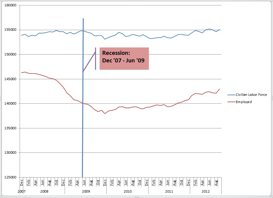
OK, so what does a real economic recovery look like?  Below are graphs showing the size of the civilian labor force and the number of employed people from the official beginning month of the recessions going back to 1973.  The graphs extend out for the first forty months of recovery following the official end of each recession which is where we are with the most recent September 2012 jobs report.

♫ ♪ One of These Things is Not Like the Others… ♪ ♫

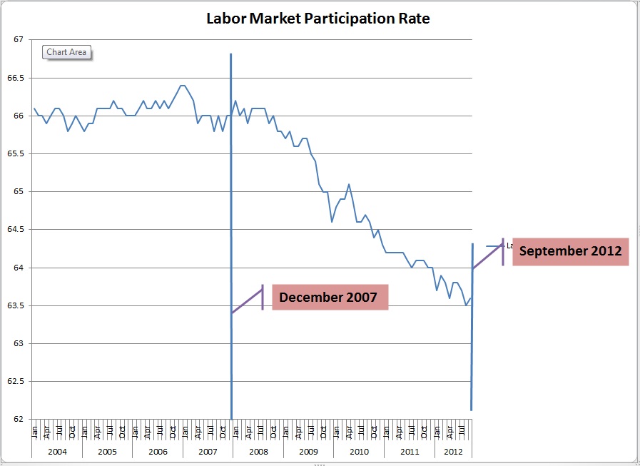
It makes sense for Big Bird to be a media headliner this week because our analysis is no more complicated than applying the Sesame Street Rule; One of These Things is not Like the Others!!  Please note the movement of the labor force size and the number of employed people.  The current “recovery” profile does not resemble any of the past 5 recoveries as the labor force size is flat.  That’s the key to the falling rate.  The final graph shows the participation rate.  As you will see the participation rate had been quite stable for the prior 4 years and then plummeted during the “recovery.”  This validates the graph showing virtually no material movement in the size of the labor force while jobs are added moving the lines closer together.  This gives us a lower unemployment rate even though the labor market is not improved.

All data for the graphs was acquired from the official Bureau of Labor Statistics historical tables which can be found at http://www.bls.gov/cps/cpsatabs.htm


This last graph shows the percentage of prospective workers who are actually participating in the labor market.  This is what is meant when you hear about all the people who have given up and left the labor market.


It’s striking.  Even the recessions that only last a few months demonstrate an increase in labor force size.  It has never been stagnant like it has been for the last forty months!

So, comparing this recession-recovery period with the previous five indicates a dramatic difference between the profiles.

Someone could tell us that this “recovery” is a flute.  If we didn’t know better we might believe it.  We could repeat it.  We could even broadcast it.  But even Big Bird would never be able to blow hard enough to make music with it…because it’s not a flute.

As always, thanks so much for reading.  We hope you enjoyed it and stay tuned…

Every effort is made to ensure accuracy of data transcription but accuracy cannot be guaranteed.  Referenced sources should be reviewed.  Any analysis represents the opinion of Blue World Asset Managers, Ltd. who does not warrant or guarantee predictions based on its analysis.

©Blue World Asset Managers, LTD Friday, October 12, 2012


How About a Little Economic Reality Check?

Thursday, September 20, 2012

Ignorance is curable. Stupid is forever.©

How About a Little Economic Reality Check?

As we watch the markets struggle with the Fed action and economic data this week, we thought we’d offer a quick summary of what’s really happening out there…and it’s not good so watch your money!

The Fed opiate QE3 is fading a bit and some economic data are taking the lead causing our market “experts” a bit of bi-polar disorder.  Watching the market intraday charts shows a market that is looking for any excuse it can find to rise.  That’s not a safe or sustainable environment so keep the defense on the field.

We cannot emphasize this point enough.  At Blue World we make a very important distinction between “data” and “actionable intelligence.”  Data is what the market “experts” react to each day as each weekly, monthly or quarterly economic report hits the wires.  This is, simply, foolish.  That’s why “experts” are such slaves to data.  One data point is useless out of context.  Trends are what matter.

Actionable intelligence is what we glean when we look at the trends of each report and {this is the important part} compare them to the trends in all the other reports plus the trends in our industry plus the trends we see in our own business each and every day.

Below we are providing links to summaries of the economic data released this week (week of 9-17-2012).  Read the summaries if you’d like but what we want you to study are the graphs.  You’ll find that when you add them all together you’ll get a much more complete picture of what’s really going on in the economy than you will by reading the headlines or even the summary of any one week or month’s report.

Starting Monday of this week we got the Empire State Manufacturing Survey and it was dismal, joining the overall trend in manufacturing..

On Tuesday we got:

Goldman Same Store Sales The report showed a drop in sales for the month and that is predictable as the back-to-school rush passes.  Take a look at the graph, however, and you can see that if you imagine out the wild volatility you see a retail sales trend that is totally uninspiring.  Ok, so how does that stack up with other reports?

Redbook which is as likely as not to confirm the Goldman report agrees this week.  More important, look at the long term trend and it is remarkably similar to the Goldman chart.  Both are lackluster, at best.

Housing Market Index What do you think people who make a living building houses and are still in business are going to be inclined to say when asked “how do you feel about the home building industry?”   The chart says it’s on the rise! YIPPEE!  Wait! The anecdotal optimism survey of builders needs to be compared to other housing data.

Wednesday gave us some more figures to consider.

Mortgage Bankers Association New Mortgage Applications This report is considered a predictor of future activity in residential real estate because people need mortgages to buy a house.  See if this chart matches the builder’s optimism chart above.

Housing Starts Starts were up a little in 2011 and very shallow to flattening so far in 2012.   Compare the “recovery” period graph to the steepness of the drop in 2008-09.  This is not what a recovery looks like.

Existing Home Sales While up in each of the last two months, two months is certainly not enough to establish a trend especially as interest rates drop to generational lows and values have plummeted causing a predictable blip. This plus the MBA Applications plus the Existing Home Sales data does not demonstrate a robust real estate recovery underway.

You know it’s Thursday when the unemployment insurance claims from the prior week are revised up!

Jobless Insurance Claims Last week’s numbers were, of course, revised higher and the moving average is up.  Regardless, this report has proven to be a relatively unreliable predicator of the official monthly unemployment report so we regard the weekly knee-jerk reaction to this report as utter silliness.

Consumer Comfort In the summary they used the word “brightening.”  Just have a look at the graph that is not only depressingly low but, also, making lower highs and lower lows, then let us know how “bright” you think consumer comfort really is!

Philly Fed Survey There was a huge one month bump in new orders (headline)…and it makes the index less negative. (not in headline) That’s the best that can be said based on this one report especially in the face of the Fed reports from last month (there is usually one that is better than the others) and the Empire report from just three days ago.

If you used today’s headlines to make decisions you’d be purchasing more inventories, hiring more employees and looking for a bigger facility.  Bad idea!

You don’t have to be an economist (“expert”) to figure this out.  As a matter of fact we have lots of evidence that not being an economist is a huge advantage in understanding reality!   You can read more about this in our posts:

 “The Confusion Suffered by ‘Experts’”

and

“The Confusion Suffered by ‘Experts’ II”

We can get a reasonably reliable picture of what’s really happening in the economy if we ignore the daily headlines and take a look at the economic data in total within the context of the short, medium and long term trends.  That is how we convert data into actionable intelligence.  That is how we non “experts” plan, predict and make decisions.


Every effort is made to ensure accuracy of data transcription but accuracy cannot be guaranteed.  Referenced sources should be reviewed.  Any analysis represents the opinion of Blue World Asset Managers, Ltd. who does not warrant or guarantee predictions based on its analysis.


©Blue World Asset Managers, LTD Thursday, September 20, 2012